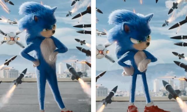
If you happened to catch the trailer for 'Sonic The Hedgehog' trailer the other day, the reaction online has been, how shall we say, less than positive.
Ranging from "Hey, that doesn't look right..." to "Sonic's human teeth and lifeless eyes haunt my waking dreams", the trailer has now become a meme in and of itself. But more than that, it's spurned a lot of talented people into action by revamping the design of Sonic. Whereas the original design looks like something from David Lynch, the fan-made designs look... just better?
Here's a couple of examples we've tracked down on Twitter, just to give you some perspective.
Left is original screenshot. Right is my rework to make #Sonic more stylized. pic.twitter.com/IhXeAZYlQI
— Edward Pun (@EdwardPun1) April 30, 2019
I'm just having some fun with #SonicMovie pic.twitter.com/RavvrmKv2x
— Zeigarian 🇨🇦🖤🏳️🌈🌌 (@Zeigarian) May 1, 2019
Of course, it's easy to take one single image and run it through Photoshop to reshape it because it's static. It's another thing entirely to have to replicate that same design across an entire movie, let alone animate it and make it speak convincingly. Still again, that thing in the trailer is probably going to make small children cry with its human teeth and flat, empty eyes that speak of an unknowable horror just waiting to be unleashed.
Another fact in all of this is that Sonic exists in the public consciousness in a 2D space on a TV screen. The old 16-bit imagery we know and love from the Sega Mega-Drive doesn't lend itself to a 3D, photo-real existence like this. That means any attempt to place that design - which is inherently not meant to be viewed in a 3D perspective - is going to look weird. Not mouth full of human teeth weird, but still weird.
Who knows, maybe they'll change the design? 'Sonic The Hedgehog' arrives in Irish cinemas in December.


