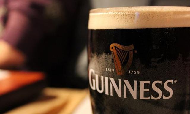
As Irish brands go, there's none more iconic than Guinness.
The distinctive harp and the "Estd 1759" text is recognisable all over the globe and has been used by Guinness for more than two centuries.
Now for the first time in over a decade, Guinness have decided to update the design of their logo. The update comes via London based creative agency Design Bridge.
Before:

After:
.png)
While the Guinness text font has been slightly modified, the real change lies in the repositioning of the 'Estd 1759' text onto the iconic harp.
Here's a closeup of the detail that went into the harp.

Thoughts? We think it looks pretty sharp anyways. In more ways than one.
Via Brand New


