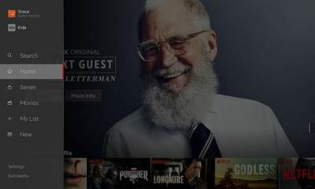
Netflix is set for a new look as of today as the streaming service has unveiled a new design for their TV experience that will now begin rolling out to members all over the world.
The new interface is set to make it easier to find the titles you are looking for on the TV app with Stephen Garcia, Director of Product Innovation at Netflix saying that it was "designed to make the Netflix experience simpler and more intuitive in a few different ways".
He continues: "First, it is now easier to search and view new content added to the service. It is also far simpler to start browsing with either a series or movie; our research has shown us that while a member generally isn’t sure what exact title they want to watch, they have a pretty good sense of whether they are in the mood for a quick series episode or a longer movie experience. We've also made it easier to access titles you’ve saved for later viewing in My List. In our testing of this new interface, we saw that that this simpler design helped members find something great to watch.

"While this may feel like an obvious update to some, validating that this TV experience was better for our members took extensive research, testing and technology improvements. Along those lines, we will continuously learn from our members and evolve the TV experience so that it gets even more simple, fun and easy to find the stories that make Netflix great.
"Much like how introducing video previews to the TV experience a few years ago helped cut down on how much time members spent browsing, this new design is one of many improvements we will be rolling out over the coming months to make Netflix even better for our members around the world. We hope you enjoy!"


