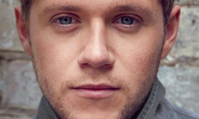
It's been a week since Niall Horan's debut album 'Flicker' was released, and there's no question that it's done extremely well in terms of sales.
The album hit #1 on iTunes in 61 countries and went straight in at number 1 in charts around the world, including Ireland - and it's heading for the top of the US charts, too.
However, many people have been pointing out that the font used on the word 'FLICKER' on the album artwork looks very like a bad word - particularly when you notice it from far away, say... on a billboard.
This is a problem that only Clint Eastwood might understand.
Why is Niall Horan's album called "Fucker"?#eponymous pic.twitter.com/iwwcgYmT4h
— Cthulhu-y (@DirtyButClean) October 26, 2017
Niall Horan Fucker pic.twitter.com/4AEIrUj2CA
— BallyHun (@PostEmoLyfe) October 26, 2017
Seriously thought Niall Horans album was called "Fucker" .... have to say I'm slightly disappointed #NiallHoran #OneDirection pic.twitter.com/EeKtLM04fq
— JennyTheWren (@Thewrenchild) October 25, 2017
gonna listen to fucker by niall horan for the first time pic.twitter.com/KFDj8VviX5
— ‹•.•› (@kazbrekur) October 25, 2017
I can't be the only person who saw this as "Fucker" not "Flicker" #NiallHoran #Flicker pic.twitter.com/3YWoE9a22q
— Bⓔ̇C (@Himeetbecca) October 25, 2017
I don’t know who Niall Horan is and on looking at iTunes today thought Ramsey Snow/Bolton had released and album called Fucker.
— Daniel Alcorn (@DanielAlcorn) October 25, 2017
Wasn't wearing my glasses this morning and for a bizarre moment I genuinely thought this said "Niall Horan Fucker" pic.twitter.com/m3D8cWCaY4
— Muggs (@iammuggs) October 24, 2017
Definitely thought Niall Horan’s new album was called Fucker for a second pic.twitter.com/DFnhpSvlx5
— Justin ✨ (@JustThomp) October 23, 2017
Get yourself a Niall Horan 'Fucker' teeshirt pic.twitter.com/tlkmzGyaAN
— 99th Dead BalloonðŸÂ?Â? (@99thRedBalloon) October 22, 2017
Guess who 100% thought Niall Horan’s new album was called ‘Fucker’? pic.twitter.com/1A5lk6RWYo
— Cassie (@cm_leung) October 22, 2017


