The 'Grand Theft Auto' trilogy sees 'Grand Theft Auto 3', 'Vice City', and 'San Andreas' in one package with quality-of-life improvements such as weapon wheel and a radio station selector similar to 'Grand Theft Auto 5' but one decision has sparked controversy among fans.
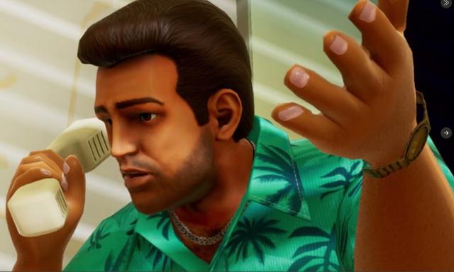
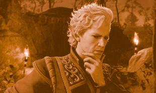
The choice to make the graphics more "cartoonish" and less life-like has split opinion, with some preferring the older murkier graphics and some enjoying the fresh coat of paint thrown on the games.
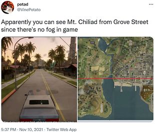
A thread by Twitter user @VinePotato documents some of the changes made in the game.
From our own hands-on experience with the game for review purposes, 'Grand Theft Auto 3' is the game that has received the most substantial graphical overhaul, with it's atmospheric David Fincher-esque city having a bit more life in it, the neon-tinged 'Vice City' still retains most of it's 'Miami Vice' and Michael Mann hue and 'San Andreas' has lost the weird orange tinge that hung over the game.
The graphical improvements have also caused some problems with the draw distance, with players reporting they are able to see Mount Chiliad from Grove Street.

The trend of remastering games and overhauling their graphics can sometimes have an unintended consequence; the 'Silent Hill' games were remastered for Playstation 3 and Xbox 360, and players complained of the games having their characteristic fog absent.
The fog was a design choice in the original games owing to the technical limitations of the consoles, so a design choice borne out of necessity ended up being a pivotal part of the game.
Similarly, the limited draw distance in the PS2-era 'Grand Theft Auto' games gave the games a sense of scale, which is absent from the new release.
The remastered trilogy is also missing some tracks that were present in the original games, but the blame there cannot be laid at Rockstar's feet, retaining music licenses is infamously tricky.
We are still early on in our review process, but a full review will go live on our site sometime next week - stay tuned!


