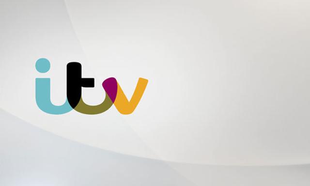
ITV became ITV1 a while back, when ITV2/3/4 came on the scene. Thing is, no one called it ITV1, just ITV, or in this neck of the woods, UTV. So, with that in mind, ITV bigwigs have rebranded as ITV, and they presumably spent a wedge for some creative to come across with this new logo.
Digital Spy are currently hosting a poll to see what their viewers think, and the response has ranged from "cheap and nasty" to "very nice to look at".
I don't like it. It just reminds me of a multicolourd arse floating in space with a 'V' tacked on to the end. Or some kind of sordid technicoloured three-way between random letters that don't usually hook up in such a fashion.
What do you think?


